Strategic redesign of the ETX Capital brand, modernising the brand and expanding their target audience
COMPANY
ETX Capital
London, UK
my role
UX and UI design, research, usability testing, brand guidelines
Team
Jaci Aricheta, Aline Ungewiss (marketing), Robert Jeffers (product)
Year
2018 - 2020

ETX Capital was a financial brokerage firm based in London, offering online trading services in various markets, including forex, indices, commodities, and equities. They provided trading platforms for both beginner and experienced traders, along with educational resources and market analysis tools.
The redesign project was my biggest project with ETX, I was a multidisciplinary designer. I worked on the website, on other print and digital creatives, and I also worked on their mobile and desktop platforms primarily adding and improving features.
Scope
The scope of revamping the website and creatives included defining the design deliverables, working with multiple stakeholders, conducting research (competitor analysis, data analysis) and designing new visual elements and branding, testing and working closely with engineers.
So why the redesign?
The decision to revamp the ETX Capital website came from realising that our focus on high-end clients was limiting our growth. The premium design feel pushed away a lot of potential clients, causing significant drop in sign-ups.
The also felt website felt out of touch. So, it was decided to make it more user-friendly and relatable, while still keeping it professional. The new brand, website, and strategy aim to welcome everyone while still keeping that air of sophistication.
UI issues
Styling was outdated
Layout was cluttered
There was lack of visual heirarchy
UX issues
Complex registration process
Confusing information architecture
ETX Capital Website
Before and After Homepage
In my redesign of the homepage, I focused on simplifying navigation, decluttering the layout, improving visual hierarchy, and modernising imagery.
In the navigation menu, I removed unnecessary links, and cleaned up the layout for a more user-friendly experience. Clear visual hierarchy now guides users to key information, and I've introduced high-quality, modern imagery that aligns with the new brand's identity.
Improvements
Simpler navigation
Not cluttered
Better visual hierarchy
More modern style
BEFORE
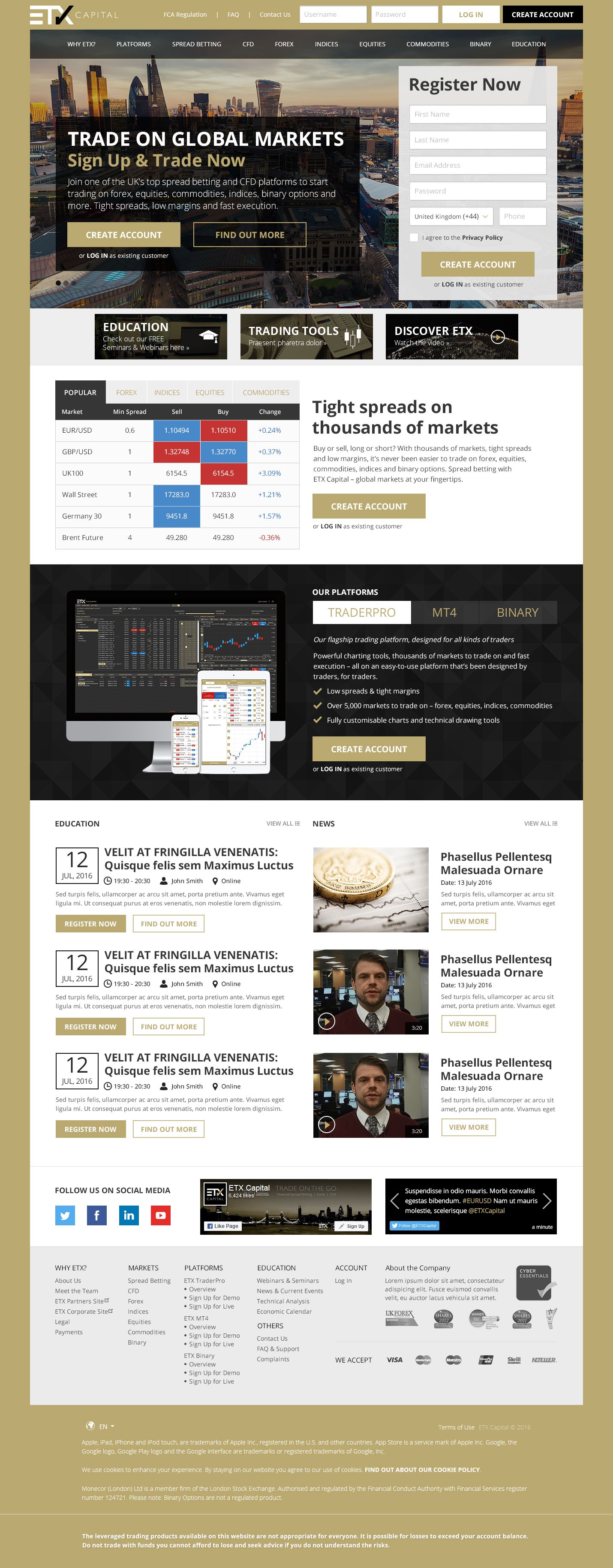
AFTER

Before and After Markets Page
In my redesign of the Markets page, I prioritised clarity and simplicity to enhance the user experience. I implemented a clearer display of text, ensuring that information was presented in a concise and easily digestible format.
By decluttering the layout and reducing the number of links, I aimed to minimise distractions and help users focus on the most relevant content. The result is a cleaner and more modern Markets page that provides users with the essential information they need, without overwhelming them with unnecessary details.
Improvements
Clearer display of text
Not cluttered
Better information architecture
Simpler display of content
BEFORE

AFTER

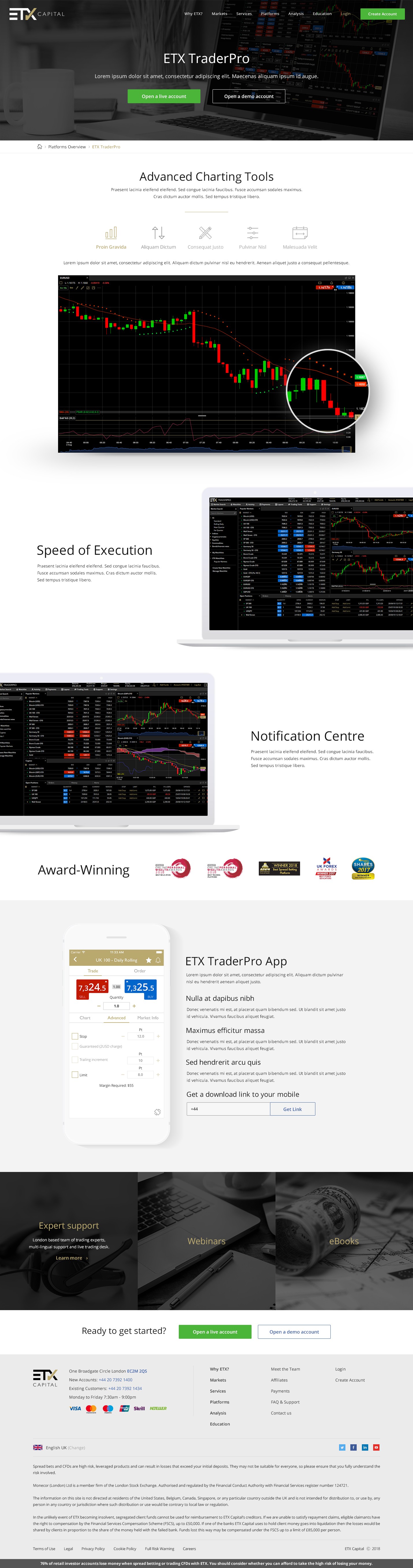
Before and After Platform Page
In my redesign of the Platforms page, I focused on enhancing readability and professionalism.
I made the text clearer and more readable, ensuring that users can easily digest the information presented. Additionally, I revamped the imagery to be more professionally displayed, providing users with a visually appealing experience that reflects the quality of the platforms offered.
To improve usability, I structured the page in a way that makes it easier to skim down and quickly find the information users are looking for. This redesign aimed to elevate the presentation of ETX Capital's platforms, providing users with a seamless browsing experience that instils confidence in the brand.
Improvements
clearer and more readable text
imagery is more professionally displayed
easier to skim for information
BEFORE

AFTER
Improving Other User Journeys
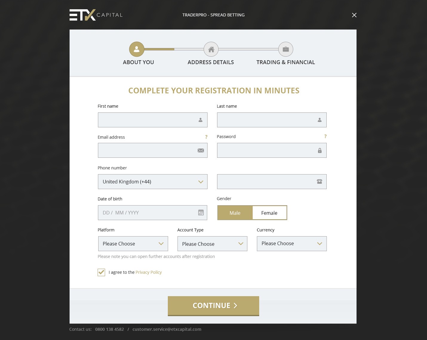
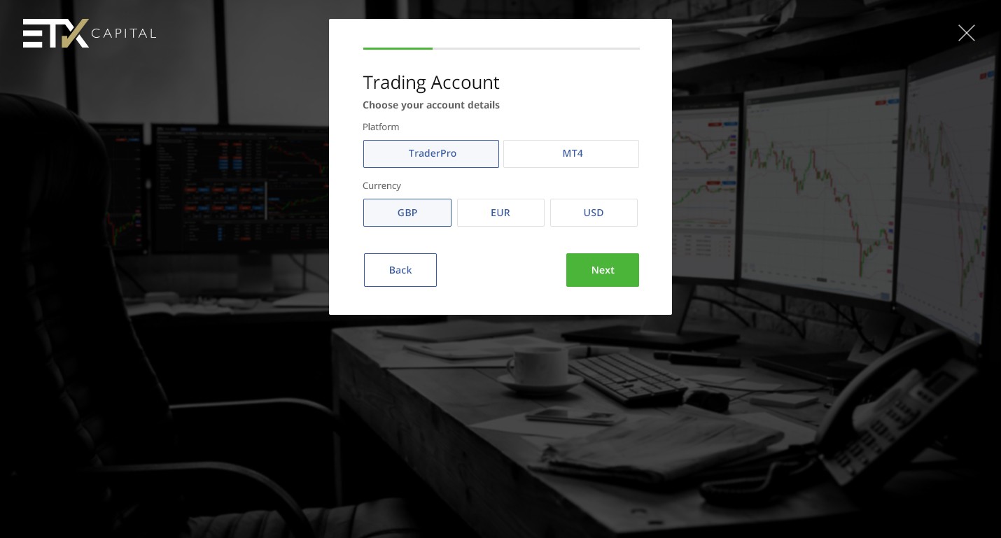
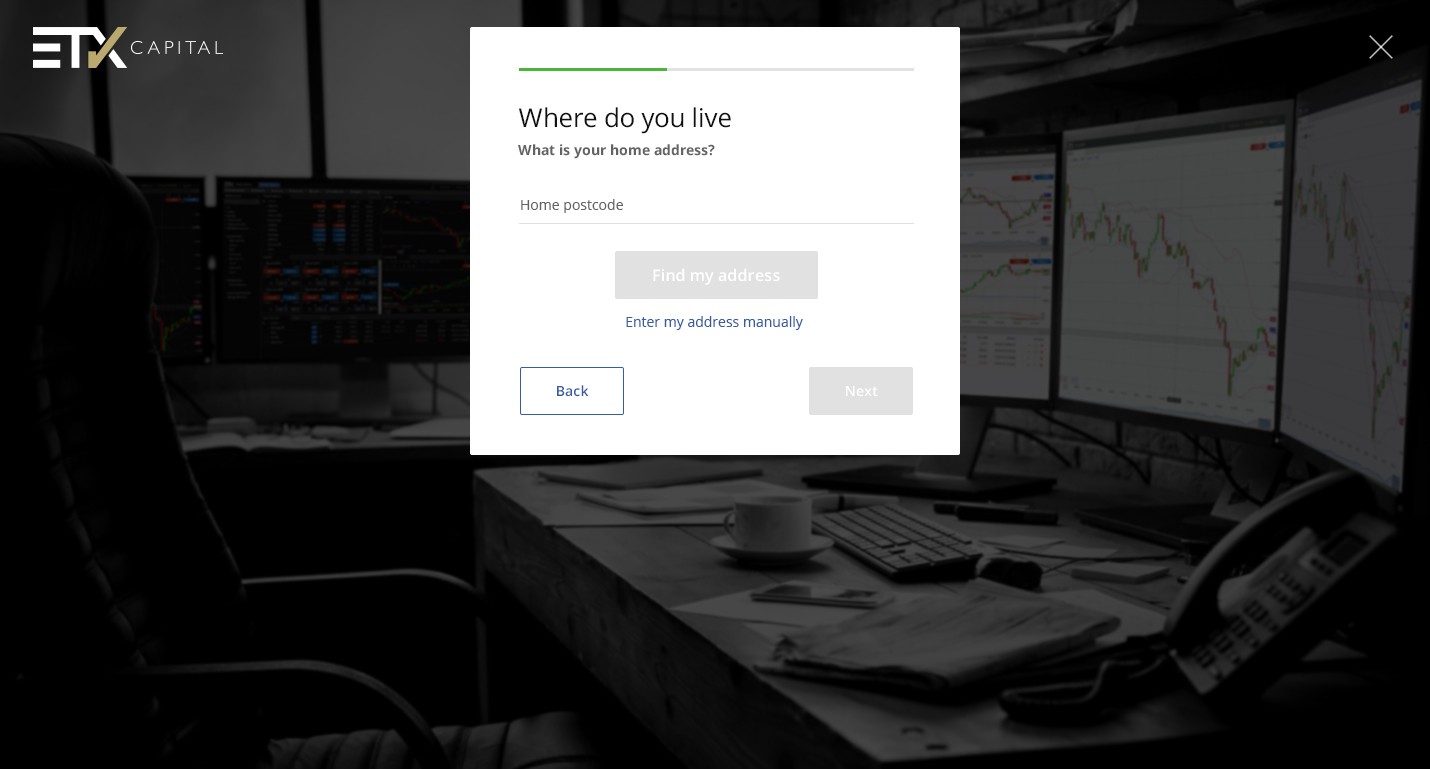
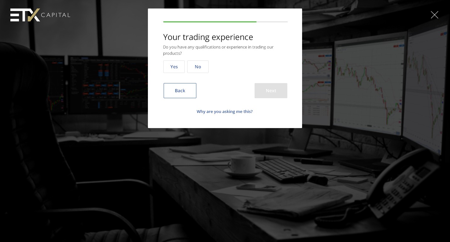
Registration Process
In my redesign of the registration process, simplicity and user-friendliness were key priorities. I streamlined the process to make it more straightforward and less overwhelming for users.
Clear progress indicators were implemented, allowing users to track their advancement through each step of the registration process with ease. Intuitive controls were also introduced to enhance usability, ensuring that users can navigate through the registration form effortlessly.
Improvements
Simplified the process
Clear progress
Intuitive controls
BEFORE


AFTER


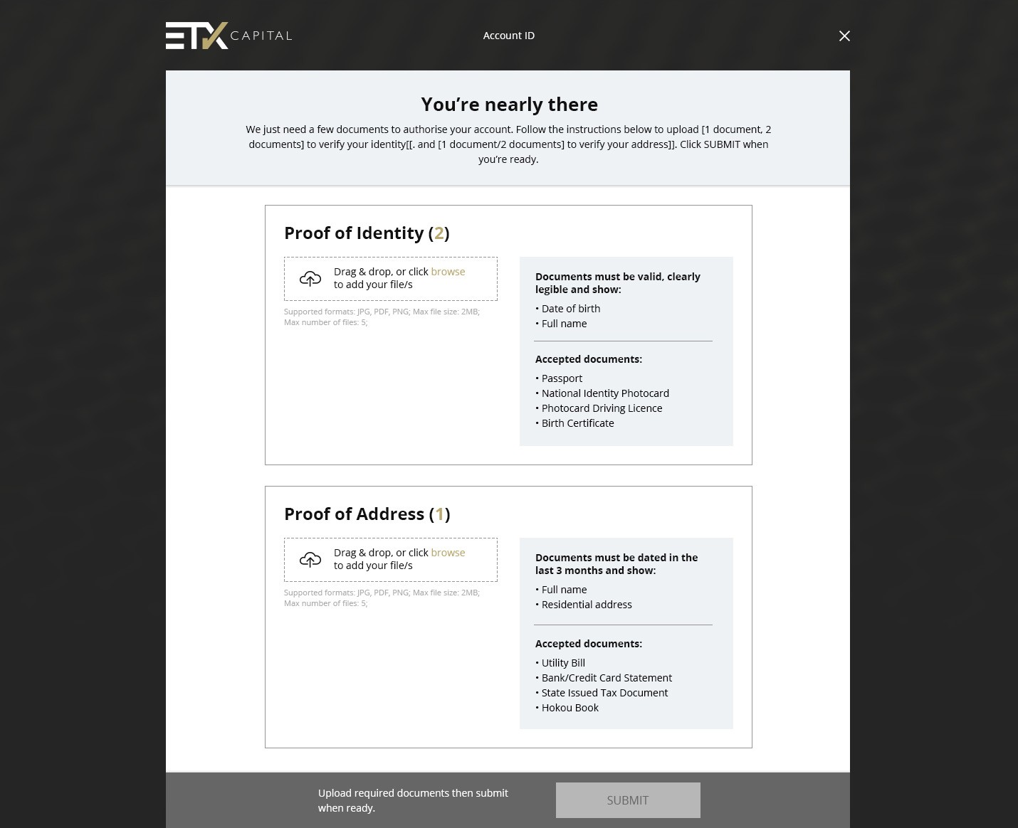
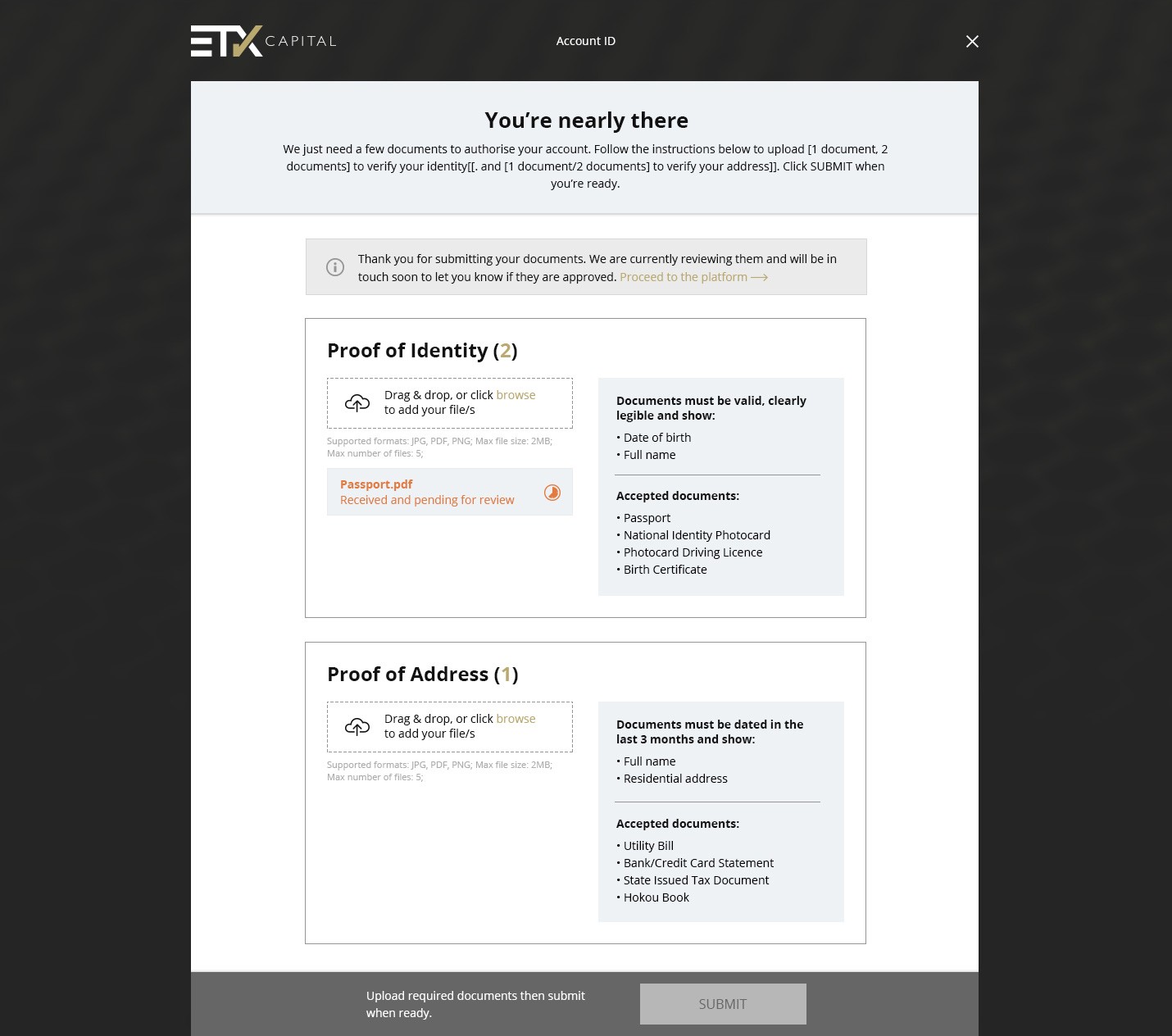
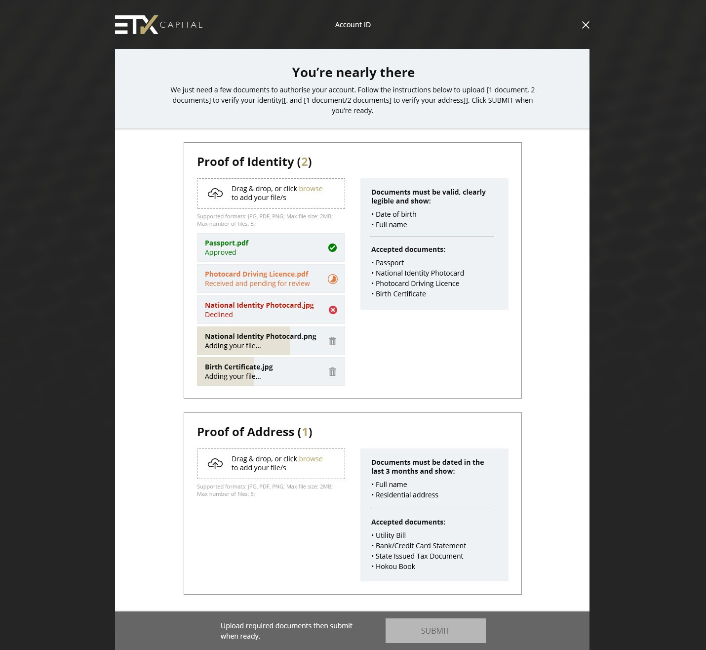
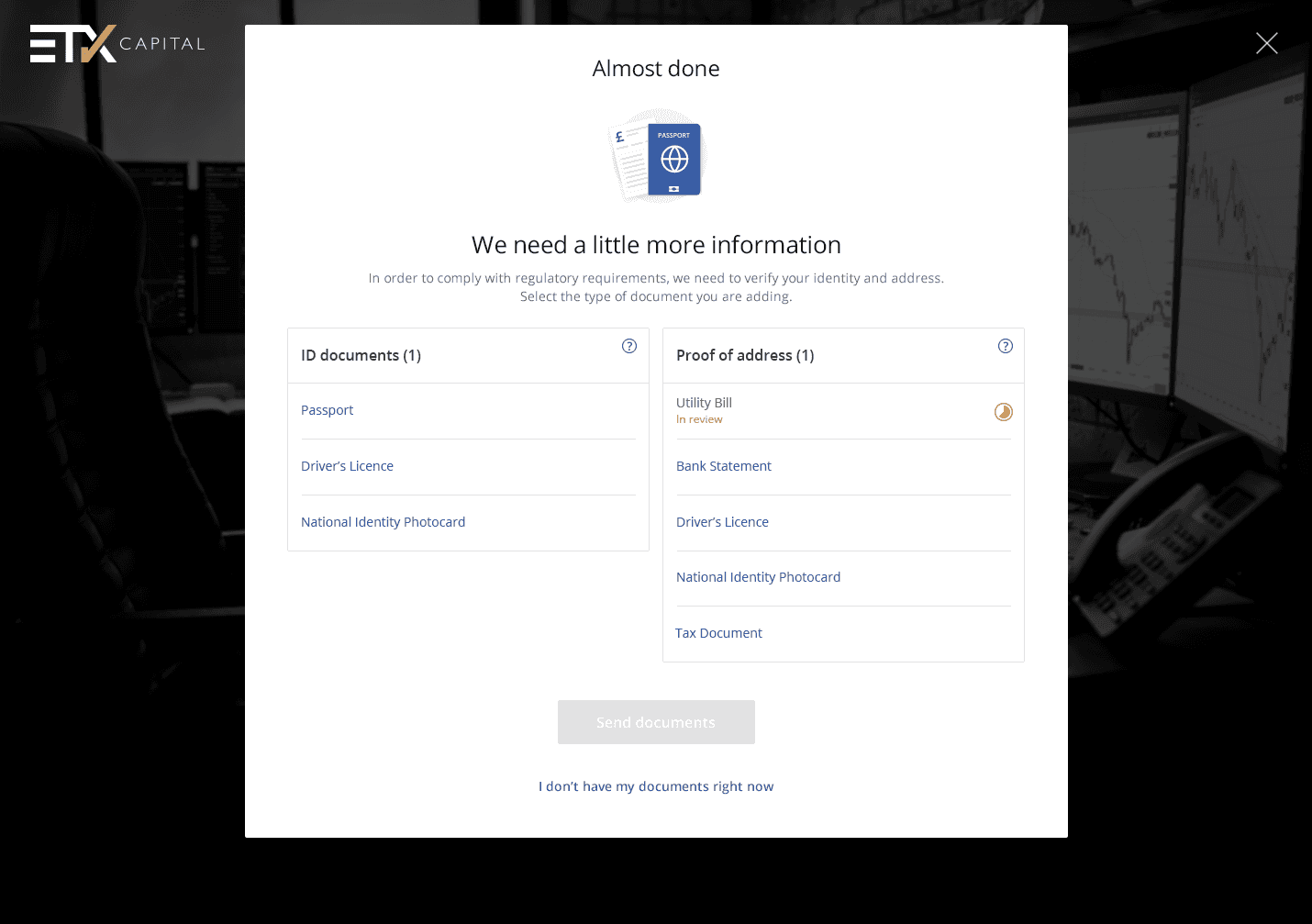
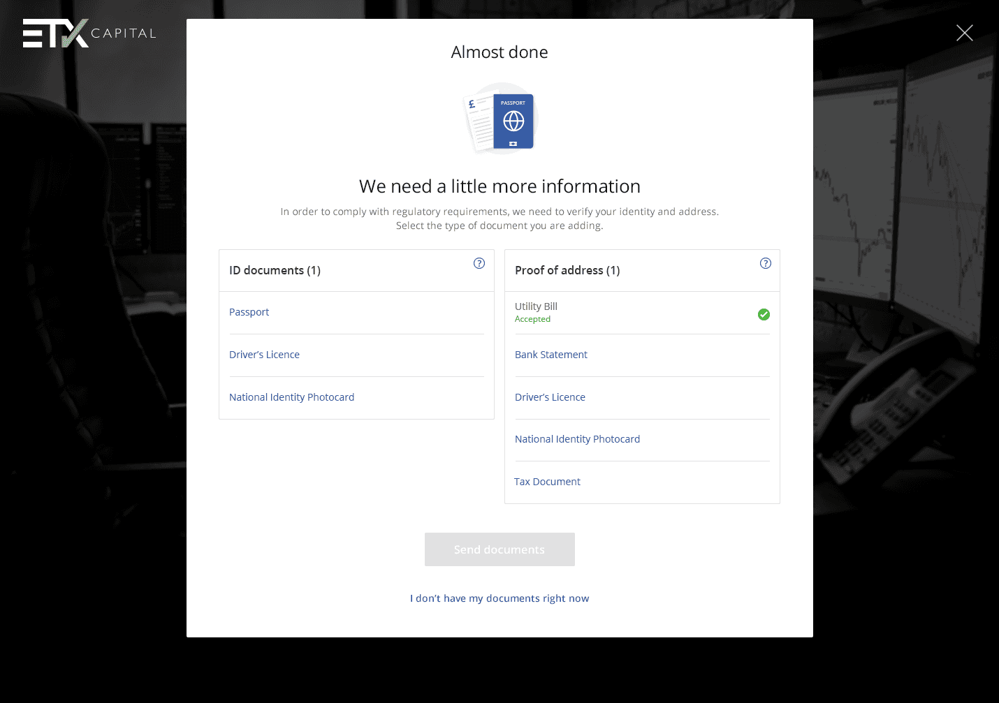
Document Upload Process
In my redesign of the document upload process, I focused on enhancing usability and efficiency. The layout was simplified to reduce clutter and make it easier for users to navigate. Additionally, I improved error handling to provide clearer guidance when issues arise during the upload process.
The user interface was redesigned to be more intuitive and user-friendly, ensuring a seamless experience for users as they upload their documents.
Improvements
Updated with simpler layout
Uncluttered
User friendly interface
Brand consistency
BEFORE
AFTER

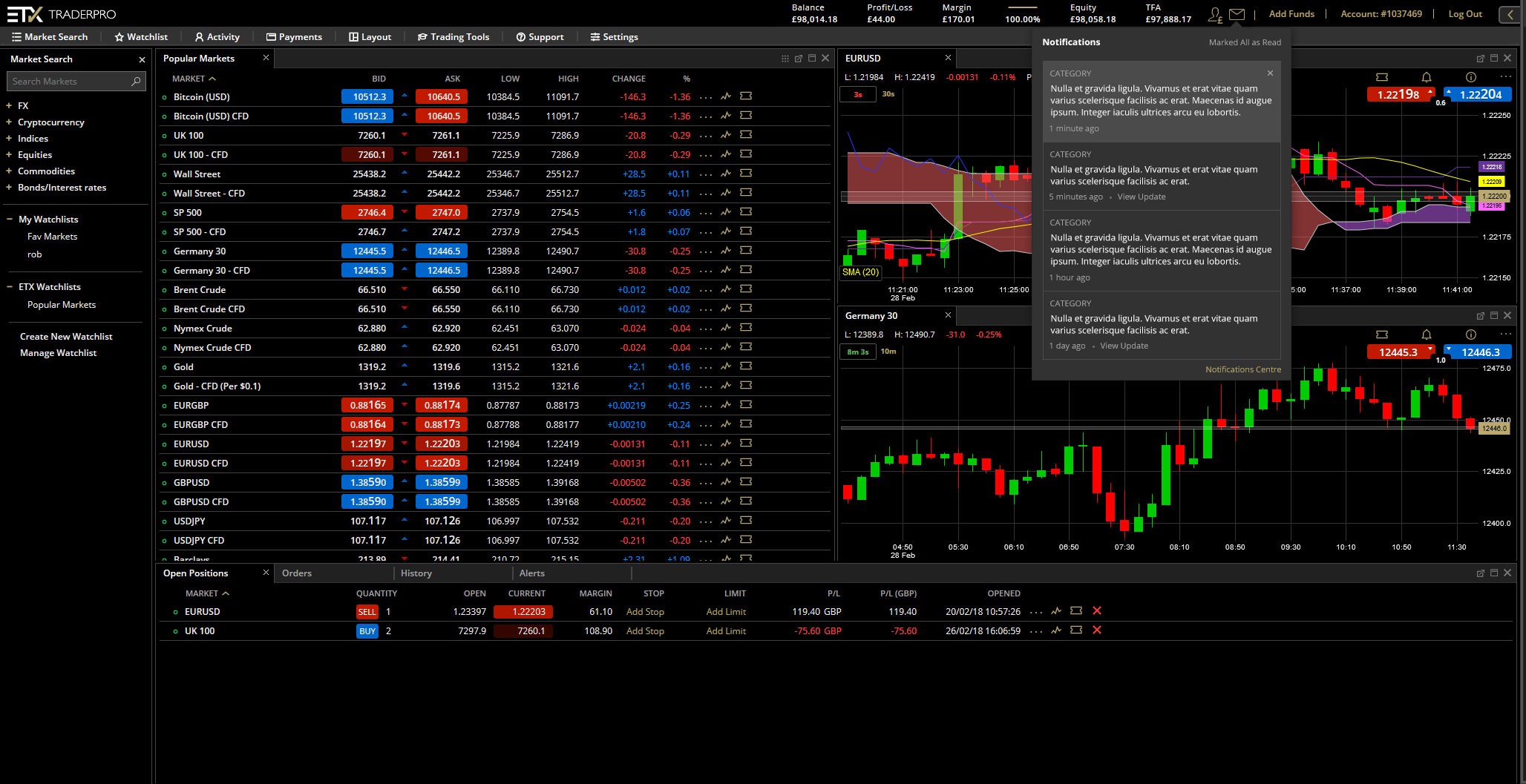
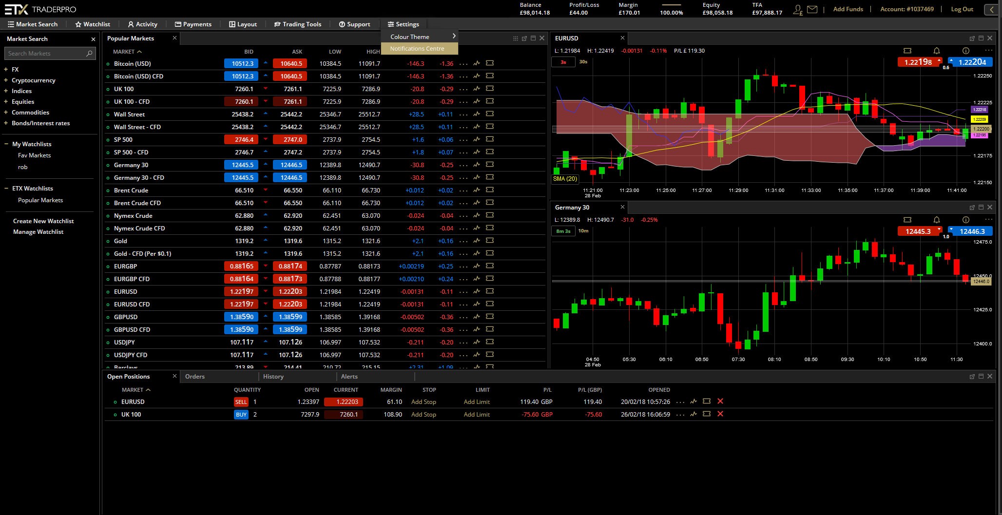
The ETX TraderPro platform was a specific electronic trading platform. It was designed to provide advanced trading capabilities for experienced traders and professionals.
The platform offers features such as customisable charting tools, technical indicators, risk management tools, and access to a wide range of markets, including forex, indices, commodities, equities, and cryptocurrencies.
ETX TraderPro aimed to provide a user-friendly interface combined with powerful trading tools to help traders analyse markets and execute trades efficiently.
Some Platform Updates
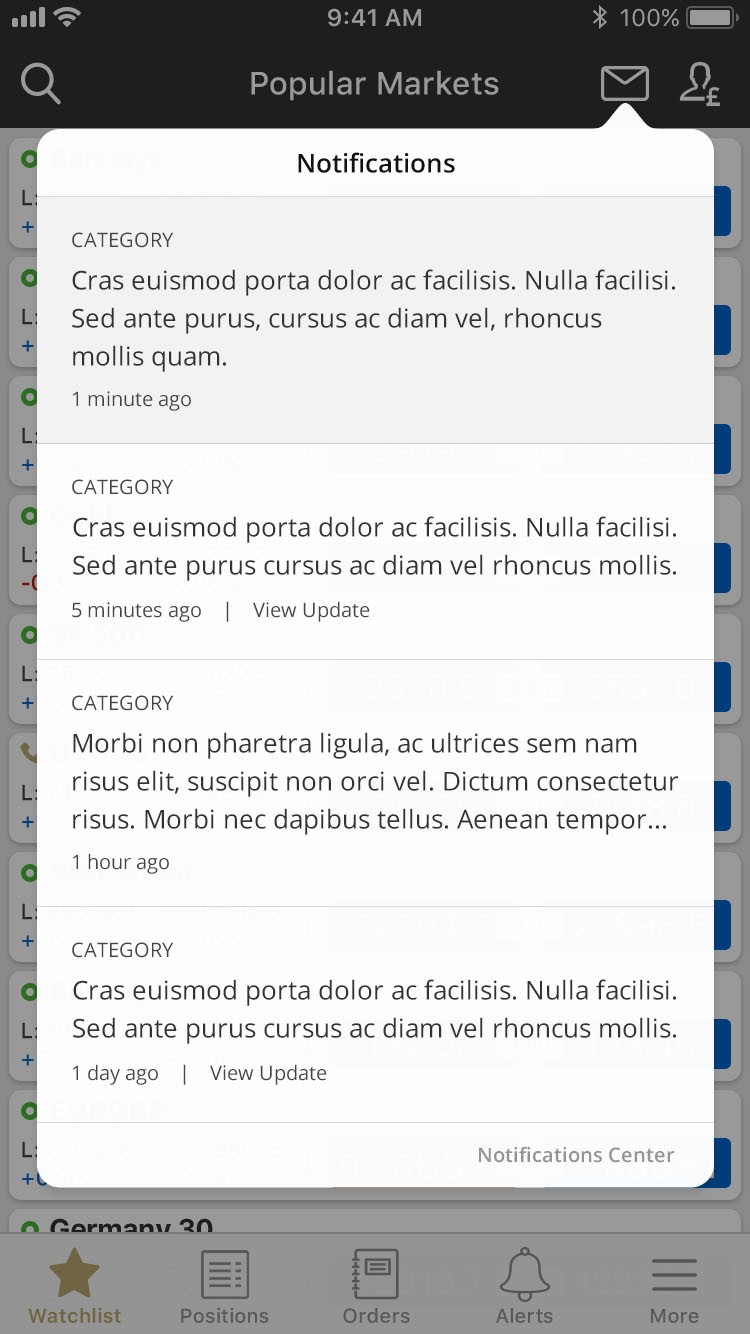
Notifications Feature - Desktop Platform
This feature was to allow clients customise the way they get notifications. I provided a design for where the notifications will be received, then the notification window there users can select which they want to get notifications on and where.


Notifications Feature - Mobile App (iOS)