Redesigning the jokes page, introducing new TRQ interaction formats, and running fake-door tests to understand what features kids wanted.
COMPANY
DC Thomson
London, UK
my role
Product Designer
Team
Product Manager, Engineers, Product Designer
SCOPE
UI redesign, UX design, fake-door testing, registration flow

Beano.com is the digital home of the Beano universe · comics, quizzes, jokes, games, built for kids. The Beano Product Team (us) builds and maintains the site. Beano Brain is a separate insights team that collects audience data and sells it to brands. TRQs · Totally Random Questions · are short survey-style questions sprinkled across the site, embedded mid-page in jokes, quizzes, games, and longer content. The more kids engage, the more TRQs they see. The more TRQs they answer, the more data Beano Brain has.
Why it mattered to the business…
Every extra minute a kid spends on the site is another chance for a TRQ to surface and be answered. Our work directly fed that pipeline · not because it was designed around data collection, but because making the site genuinely better for kids to use and making it more valuable to Beano Brain were the same goal.
Beano.com needs more varied and interactive experiences to give kids reasons to return because a single TRQ format and passive content pages are not enough to sustain meaningful interaction.
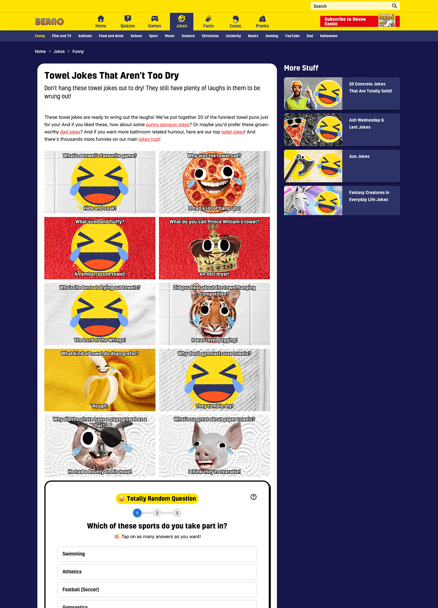
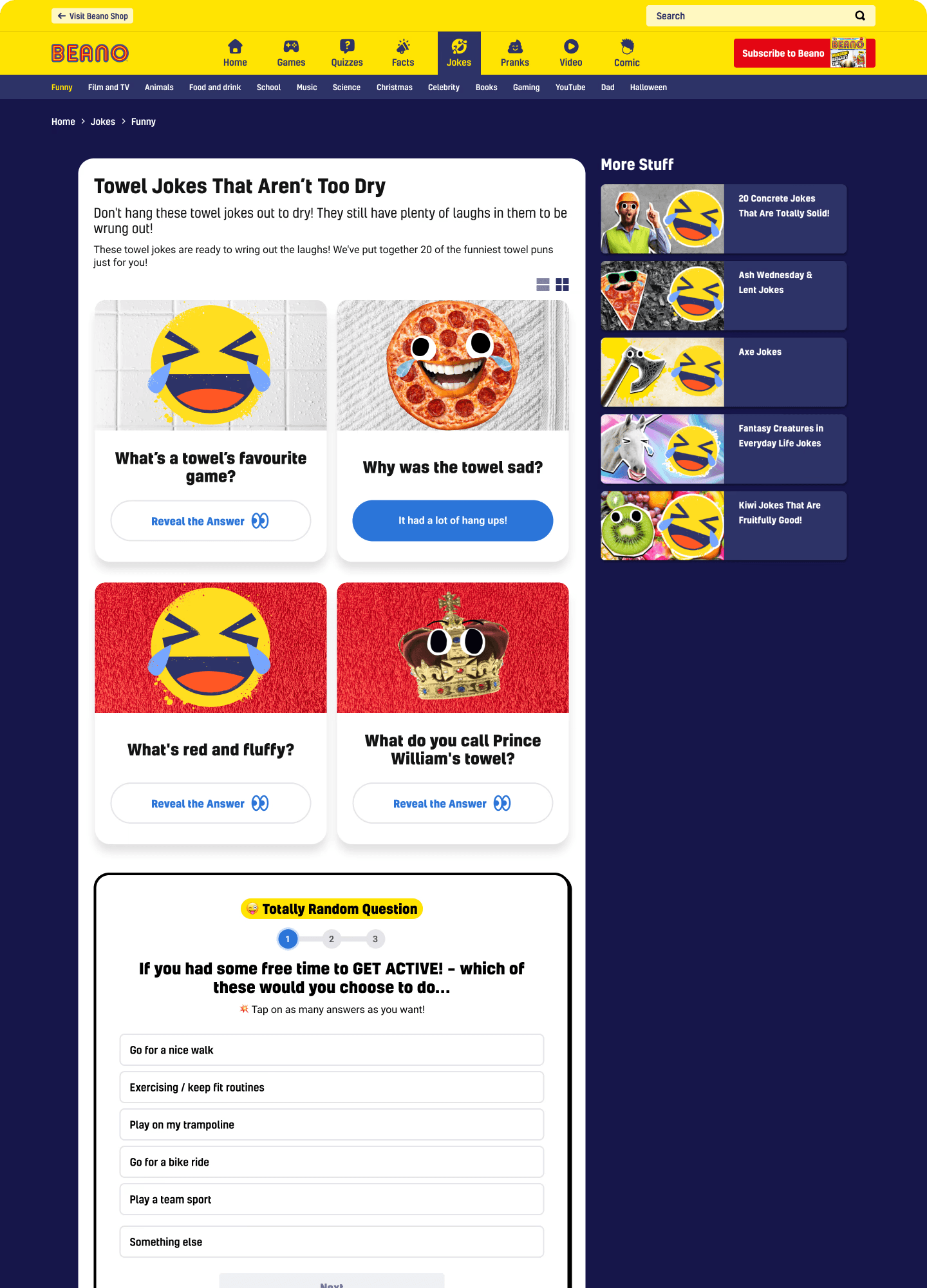
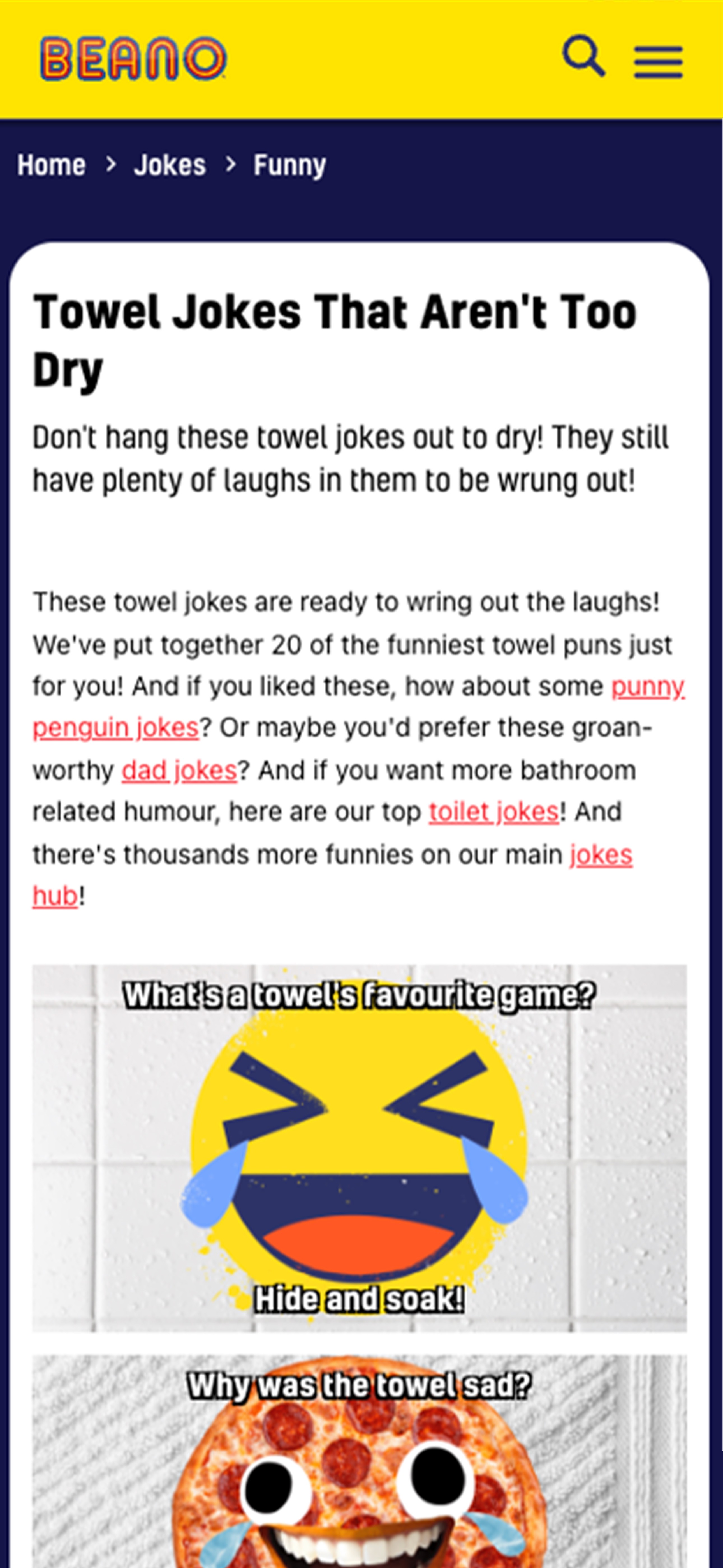
Jokes page redesign
Jokes was the second most popular content type on Beano.com, pulling 1.3 million views over 12 months. But the format was passive. Kids arrived, skimmed a grid of image cards with text baked in, and left. The TRQ embedded mid-page was rarely seen, let alone answered.
There were two problems worth solving. The first was accessibility: joke text rendered inside images meant it couldn't resize, couldn't be read by assistive technology, and was often illegible on smaller screens. The second was engagement: a long static scroll gives kids no reason to stay.
BEFORE: desktop: image-heavy grid, text baked into images, TRQ buried mid-scroll
AFTER: desktop: readable HTML text, allows interaction for answer, TRQ visible right away
The first iteration moved mobile to a carousel format: one joke at a time, swipeable. But early on it didn't outperform the stacked version. Kids weren't sure what to do with it. So we added two things: an onboarding instruction card ("Tap for LOLs. Swipe for new jokes.") and left/right arrows to signal there was more content to discover. Once those were in, the format clicked. Kids had the context they needed to engage with it.
Jokes page on mobile from Before and After view
OLD JOKES PAGE MOBILE

AFTER: Instruction card
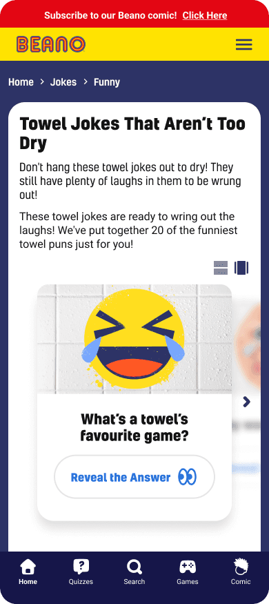
AFTER: carousel
The desktop design retained a grid layout but shifted to the same text-as-text approach, removing the accessibility issues across both breakpoints.
OPTIONS CONSIDERED
Iterate on the existing static grid · Move to a full-page carousel/reels format · Hybrid approach with accessibility fix only
WHAT WE CHOSE
Carousel on mobile with the onboarding instruction card. Grid retained on desktop with text extracted from images across both.
For Beano Brain, that number matters beyond engagement. More time on jokes pages means more TRQ completions. The format change served both the user experience and the data pipeline.
New TRQ formats: Emoji Likert Scale
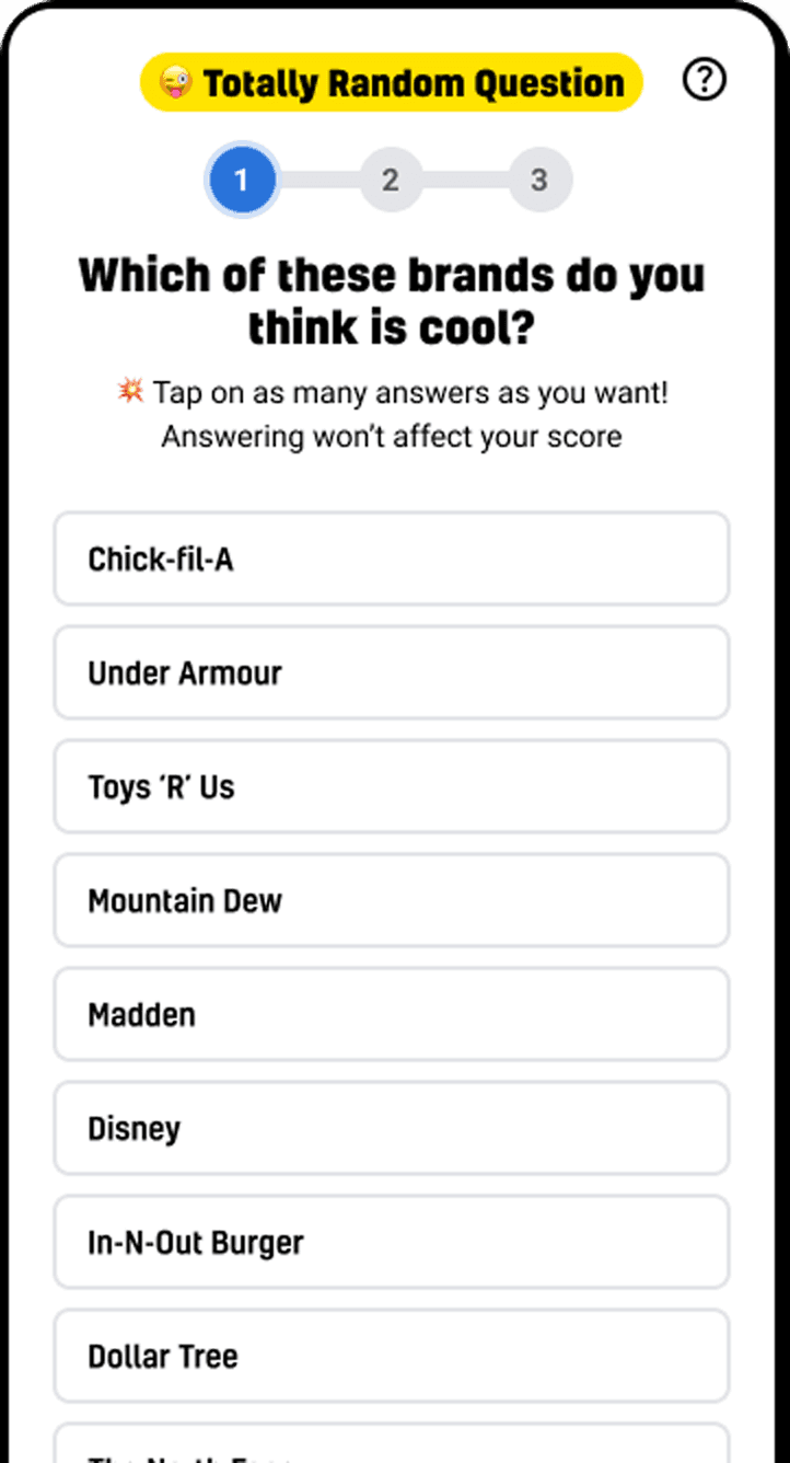
Totally Random Questions had only one answer format: a multiple-choice text list. This worked, but it set a ceiling on the kinds of questions Beano Brain could ask. Opinion and sentiment questions, "how much do you agree with this?", couldn't be expressed well as a list of options. The format also felt more like a form than part of the site.
Existing TRQ Format: Multiple Choice
Existing format · multiple choice text list. Works for factual questions; doesn't suit sentiment or opinion.

The brief from the client and internal feedback both pointed toward more variety and expressiveness. The team explored two new Likert-style formats.
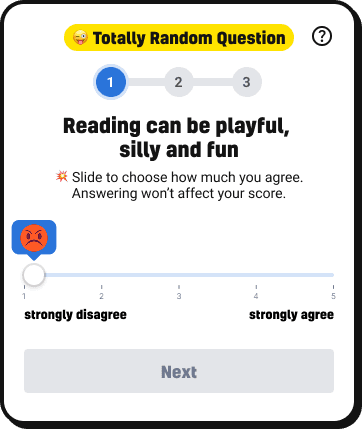
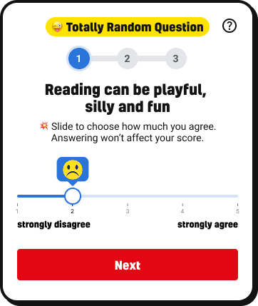
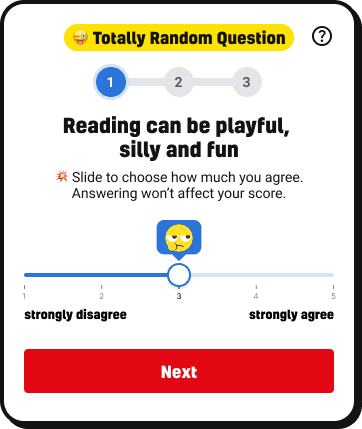
New TRQ Format: Number Slider
Number Slider 1 view
Number Slider 2 view
Number Slider 3 view
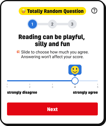
Number Slider 4 view

Number Slider 5 view
The number slider was a joint exploration. It allowed precise positioning on a scale of 1 to 5, with an emoji appearing above the thumb as you dragged. Functionally it worked, but it still asked kids to think in numbers, an abstract layer between them and their answer.
New TRQ Format: Emoji Likert Scale
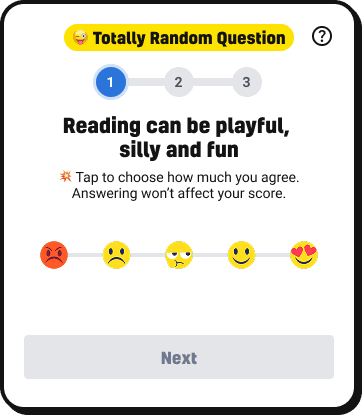
EMOJI LIKERT SCALE 1 view

EMOJI LIKERT SCALE 2 view
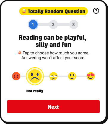
EMOJI LIKERT SCALE 3 view
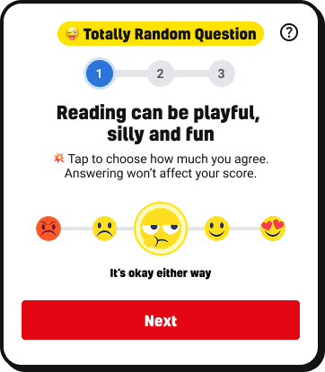
EMOJI LIKERT SCALE 4 view
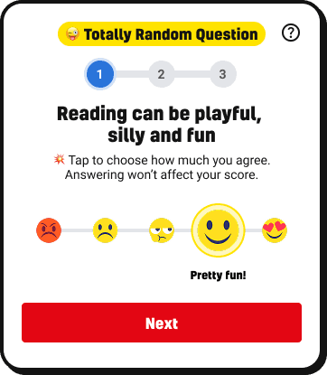
EMOJI LIKERT SCALE 5 view

EMOJI LIKERT SCALE 6 view
The emoji scale was my direction. I wanted to remove that abstraction entirely. Five faces on a line, from angry to heart-eyes. Tap the one that matches how you feel. The selected emoji grows and shows a plain-English label: "No way!", "Not really", "It's okay either way", "Pretty fun!", "Absolutely!" No numbers, no interpretation required. The answer is the feeling.
OPTIONS CONSIDERED
Keep multiple choice only · Add number slider (1–5 draggable) · Add emoji-based Likert scale · Both slider and emoji
WHAT WE CHOSE
Emoji Likert scale as the primary new format. My recommendation was to go emoji over slider considering who the audience is.
From workshop to fake-door tests: exploring what would make kids come back
The team ran a workshop to map out what features could make Beano.com feel more personal and worth returning to. Ideas included a leaderboard, the ability to save quizzes and jokes, liking and following topics, and getting personalised recommendations. Rather than build any of these outright, the team decided to test demand first using fake-door tests on the live site.

team session mapping feature ideas
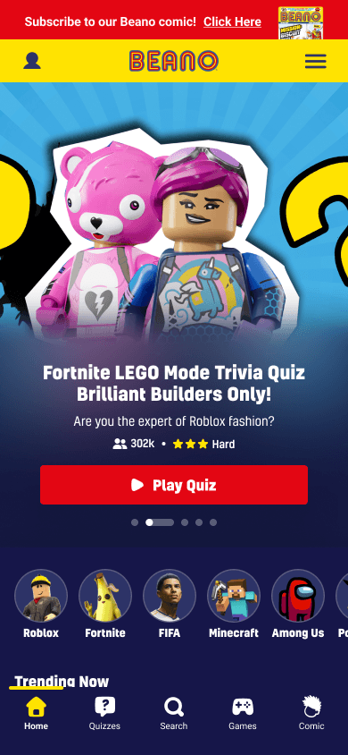
Three features were tested on real Beano.com pages: a Beano Leaderboard shown on quiz results pages, Save and Like buttons on quiz and content pages, and a Login prompt in the navigation.
Fake-door test: Leaderboard
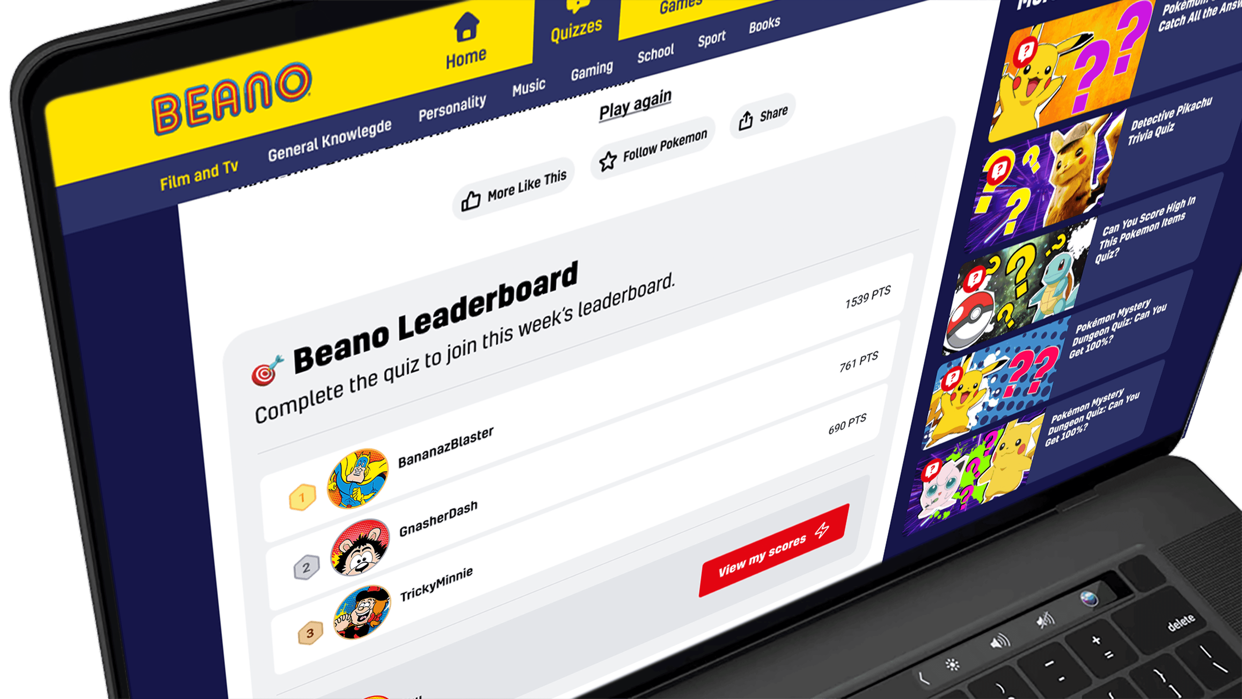
Leaderboard · low interest
Fake-door test: Like & Save

adding Like & Save buttons · significant engagement
Fake-door test: "Coming Soon"

"Coming Soon" · the fake-door reveal
The results were telling. The leaderboard generated low interest. Save and Like drew significant engagement, suggesting kids genuinely wanted to hold onto content they liked and revisit it. The nav login, on its own, didn't drive much action · which confirmed what most product teams eventually learn: a login prompt only works when there's a compelling reason to use it.
A login button in the nav is only useful if kids already know why they'd want an account. It can't do the selling on its own.
OPTIONS CONSIDERED
Single-stage UI and features launch · Defer UI until features ready · Stage the rollout.
WHAT WE CHOSE
Stage the rollout: visual first, features second. Short-form formats added in parallel.
WHAT WE TRADED
A single tidy launch, in favour of shipping momentum and getting earlier feedback.
Designing the registration flow
I designed the full registration and login flow with the safeguarding constraint at the centre. The onboarding opens with character and username selection, using Beano's own characters and an auto-generated username so kids never have to share their real name. From there, the flow requires a parent or guardian's email to proceed. The parent receives a verification code, and the account is only secured once that step is completed.
adding in login on the nav

login overlay & create account

benefits pop up

choosing character & name
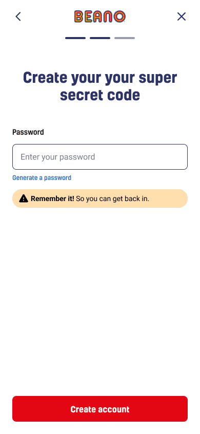
aka: password

option to secure account
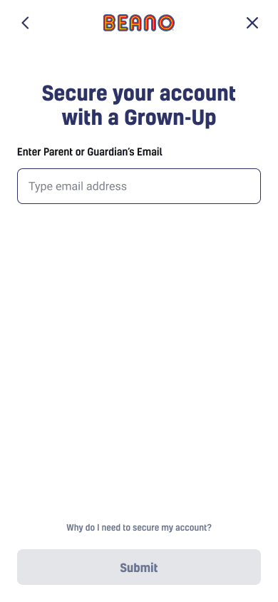
parent or guardian's email
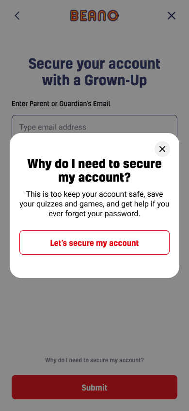
explanation why

email code
Every screen accounts for the possibility that a child might not understand why the parental step exists. There's an inline explainer: "Why do I need to secure my account?" which a kid can tap before deciding whether to continue. The language throughout was deliberately child-appropriate. The password screen is called "Create your super secret code." The tone is consistent with the Beano brand without compromising the clarity of what's being asked.
The registration flow was a design exploration. It didn't ship during this project, but it mapped out exactly what building any of the fake-door features would require, including the safeguarding infrastructure, parental consent flow, and account management. It became the blueprint for what the team would need to build next.
OPTIONS CONSIDERED
Build features directly without testing · Standard email + password registration · Full fake-door test before building anything
WHAT WE CHOSE
Fake-door tests on the live site first to validate demand. Then a full registration flow design to map out what building any of these features would actually require.
What shipped and what it showed
Note: The PM who tracked TRQ-specific response rates left the team before this case study was written. TRQ improvement metrics are directionally positive based on team feedback, but exact figures are not available to cite.
The carousel more than doubled time on the jokes page
The jokes page redesign produced the clearest signal: kids were spending more than twice as long on jokes pages after the carousel format launched. More time on page means more TRQ impressions, which feeds directly into Beano Brain's data pipeline.
The emoji Likert scale expanded what Beano Brain could ask
The emoji Likert scale shipped as a new TRQ format alongside the existing multiple choice. It expanded the range of questions Beano Brain could ask and introduced a more expressive, lower-friction way for kids to respond to sentiment-based questions.
Fake-door tests showed what was worth building and what wasn't
The fake-door tests validated that saving content had genuine demand and that the leaderboard did not, saving the team from building a feature with no appetite. The registration flow was a design exploration that mapped out the safeguarding and parental consent requirements any future social feature would need to meet.

